
Logo design and rebrand: heart women & girls
Roles: logo design, concepting, color study
HEART is a client I've worked with for several years. Their work supports and promotes sexual health and sexual violence awareness in Muslim communities through health education, advocacy, research, and training. I love working with HEART because of the organization's important mission. Supporting and celebrating the work nonprofits do is very important to me, and HEART lets me do freelance work I'm tremendously passionate about.

Organizational Rebrand
In 2017, I led the organization through a rebrand, including the development of a new logo, and a new color palette. Their old logo and color palette both were in need of an update, mostly because I found the original logo to be too complex and have too many elements. Additionally, the color palette was so saturated and bright that the pieces I worked on had such strong, contrasting colors that it started to feel like a different type of organization.
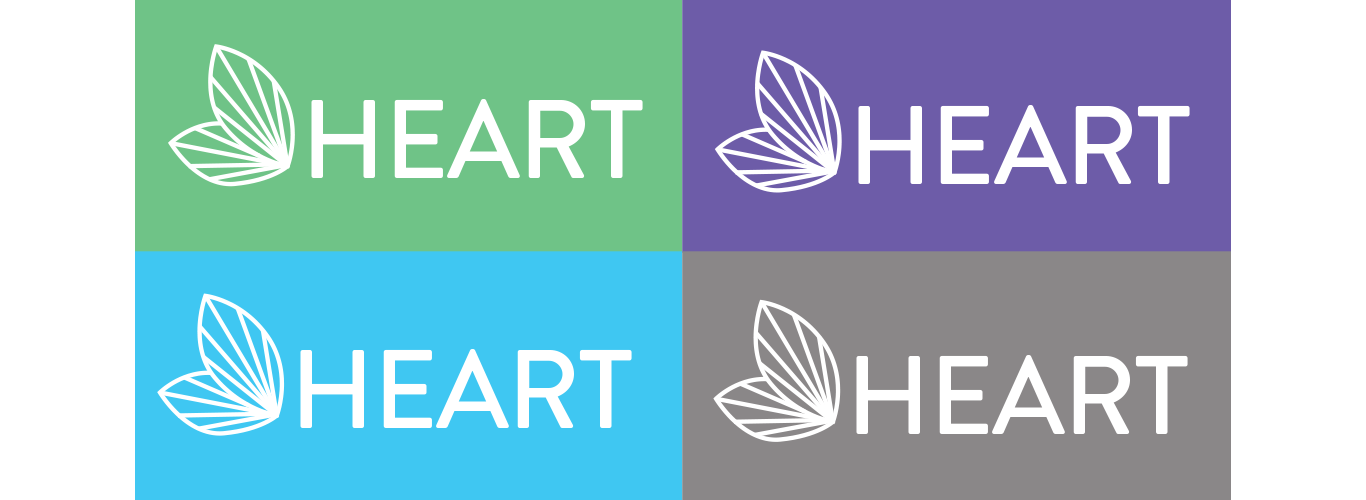
The new logo still features the most important pieces of HEART's logo. The leaf mark is an important part of HEART's tagline, "It Takes HEART to Grow," so I kept the leaf, but made an outline to make it look simpler. I chose Brandon Grotesque as the typeface because the "A" creates a pointed apex which mimics where the leaves come together in the graphic mark. What results is a much simpler, much more striking logomark.
Old Logo
New Logo


© 2017 MAT SCHRAMM